

Overview
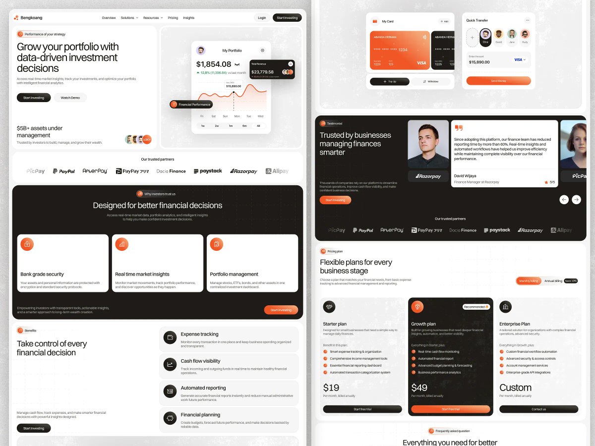
Bengkoang needed a landing page flexible enough to speak to two distinct audiences in one narrative — individual investors tracking a personal portfolio, and finance teams managing company-wide cash flow — without the page feeling unfocused or generic in the process.
The design leans on layered dashboard previews — portfolio balances, revenue charts, card and quick-transfer widgets — set inside a high-contrast black-and-white system with a single orange accent and a subtle grain texture, giving the page a premium, editorial feel rather than a flat corporate one. Core value propositions (bank-grade security, real-time market insights, automated reporting) are broken into scannable modular cards, while an early trusted-partner strip — PicPay, PayPal, Razorpay, Alipay, and others — does credibility work before the product is even explained in depth.
Further down the page, a dedicated testimonial from a finance manager and a tiered pricing section (Starter, Growth, Enterprise) shift the pitch toward business buyers, closing with an FAQ that handles final objections. The result is a full-funnel structure that walks a visitor from "what is this" through proof, pricing, and a final push to convert
Full Preview
Designing Bengkoang meant reconciling two buyer personas — the individual investor and the finance operations lead — into a single, coherent visual language instead of splitting the story across separate pages. The bold monochrome-plus-orange system, carried consistently through every section, ended up being the thread that made both audiences feel like they were looking at the same product.
It's a page built to prove that a fintech brand can feel premium and trustworthy without leaning on the usual blue-and-white corporate playbook. Interested in working together? Let's Connect!
MORE WORK
Explore more projects

START A PROJECT
Need design, development, and a faster path to live?

