

Overview
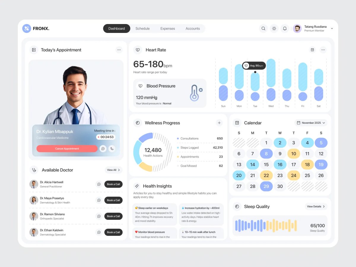
FRONX had to hold a lot without feeling cluttered — appointments, vitals, a weekly activity trend, a calendar, and daily health tips all competing for the same screen. We treated the top of the dashboard as the "right now" zone: today's appointment sits front and center with a live countdown and one-tap actions (cancel, message, call), so the most time-sensitive task never gets buried under historical data.
Below that, related metrics are paired rather than scattered — Heart Rate and Blood Pressure sit in the same card, backed by a 7-day bar chart, so a patient reads a trend instead of a single disconnected number. Wellness Progress compresses several different metrics (consultations, steps, appointments, missed goals) into one number — 12,480 Health Actions — the same trick fitness rings use to make disparate data feel like one score worth improving. The Health Insights cards go a step further by tying each suggestion to a real figure ("Increase hydration by ~400ml") instead of generic wellness copy, which is what makes the "AI-assisted" framing feel earned rather than decorative. A waveform-style Sleep Quality visual and a color-coded calendar round out the dashboard with detail that rewards a closer look without demanding one.
Full Preview
Health data carries more weight than most dashboard data — get the density wrong and it either overwhelms the patient or hides what actually matters. FRONX was an exercise in keeping that balance: dense enough to be useful, calm enough to check every day without dreading it.
MORE WORK
Explore more projects

START A PROJECT
Need design, development, and a faster path to live?

