

Overview
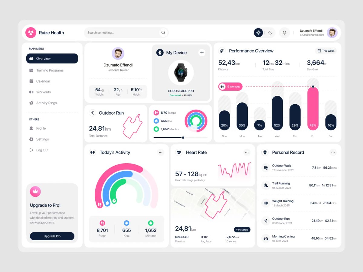
Raize Health had to surface a lot of different data types — steps, calories, distance, heart rate, elevation, GPS routes, personal records — without falling back on one generic chart repeated everywhere. Instead, each metric gets the visual it actually needs: nested activity rings for today's composition, a weekly bar chart for comparing that day against the rest of the week, a sparkline for heart rate variability over the day, and a traced route outline for outdoor runs. Together, "Today's Activity" and "Performance Overview" let a user see both immediate and week-level context on the same screen, without needing a separate history page.
The sidebar is organized around how a trainer actually works — Training Programs, Calendar, Workouts, Activity Rings — so the dashboard reads as a coaching tool rather than a generic fitness-tracker template. A single vivid accent color carries through every chart and highlight, which does double duty: it keeps a genuinely data-dense screen from feeling noisy, and it consistently marks "today" or the primary metric across every card, so the eye always knows where to land first. The Personal Record panel closes the loop — it's what turns daily tracking into visible long-term progress, which is ultimately what brings someone back to open the app the next day.
Full Preview
A performance dashboard only works if it makes someone want to keep training, not just report on whether they did. Pairing dense daily metrics with a running record of achievements was the deliberate move here — the data proves effort, the records make it feel worth repeating.
MORE WORK
Explore more projects

START A PROJECT
Need design, development, and a faster path to live?

