

Overview
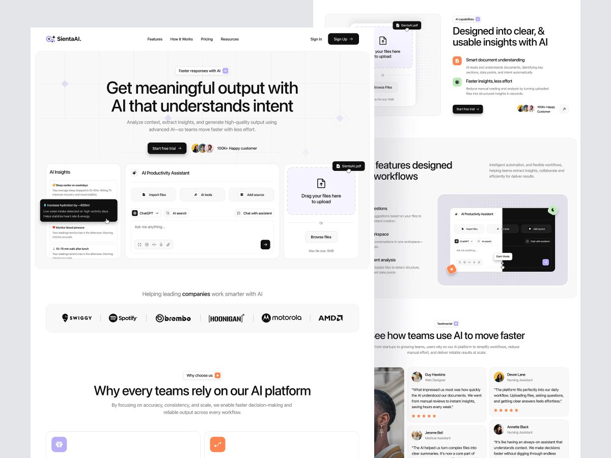
SientaAI needed a landing page that could hold two different promises at once — a personal AI that reads context (sleep, hydration, activity) and gives quiet, specific nudges, and a productivity assistant that ingests documents and turns them into structured insight for teams. Rather than picking one story, we let the hero do both: a layered stack of floating UI cards shows the assistant mid-conversation, an insight tooltip surfacing a real recommendation ("Increase hydration by ~400ml"), and a file-upload panel sitting right behind it — so the product reads as one system with two entry points, not two products bolted together.
The rest of the page backs that up with restraint: a mostly black-and-white palette with small, deliberate color accents (soft purple, orange, green) used only to mark interactive or AI-driven moments, and a dark-mode mockup placed right next to the light one to signal the product is built to live in either. Client logos (Swiggy, Spotify, Motorola, AMD, among others) and testimonials spanning designers, nurses, and medical assistants reinforce that this isn't a niche tool — it's positioned as infrastructure any team can plug into.
Full Preview
SientaAI is a good example of designing for trust before features — when the product's core value is "you can hand this your data and get something useful back," every visual decision has to make that feel safe and immediate, not just impressive.
MORE WORK
Explore more projects

START A PROJECT
Need design, development, and a faster path to live?

